I-FEST
A FESTIVAL FOR WOMEN
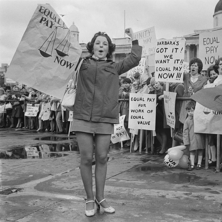
i-Fest is a celebration of women’s creativity, energy, and influence across fields. The client approached me with a static PDF containing the event’s copy, logo, and imagery, and asked me to transform it into a vibrant, motion-driven experience that would bring the festival to life online.
Brief details
Duration
3 MONTHS
Deliverable
Responsive web design
Role
UI Design, Motion Design, Animations, Visual Design
TOOLS
Figma, Photoshop, After effects, Illustrator, Runway ML, Midjourney
Project name
I-fest website design
Client
Lucid Lines
Industry
Festival, Women Empowerment, Cultural event
Client Provided Materials
Static PDF: Containing the event’s copy, schedule, and overall layout.
Logo: The official i-Fest logo, which needed to be incorporated creatively.
Images/Photography: High-resolution images representing the festival, speakers, and attendees.
Brand Guidelines : Colors and Fonts
The beginning
The beginning
I began the project by carefully analyzing the materials provided by the client to determine how best to adapt them.
The first step was to recreate the PDF in Figma as an editable document, which allowed me to experiment with spacing, layout, and hierarchy.
With this editable version in place, I could plan the first draft, exploring how to structure the content and begin mapping out motion and visual elements.
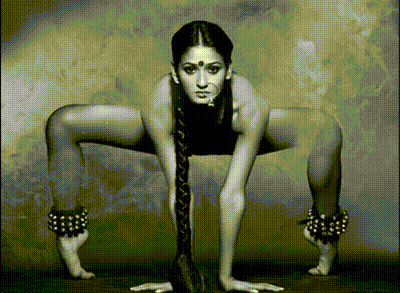
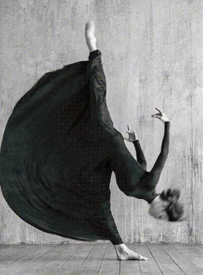
Adding Motion to images
The client provided a set of images that needed subtle motion to bring them to life. During our calls, I mapped out the animation plan, explaining how each element would move and interact.
Depending on the image, I used a combination of tools and techniques:
Photoshop: To separate high-resolution images into layers for animation in After Effects.
After Effects: To create fluid motion and bring the layered images to life.
AI Tools: For animating images that suited a more complex or stylized motion approach.
Illustrator: To redraw vector-based images and maintain visual consistency.
Through this process, I was able to create a cohesive visual harmony in motion, ensuring every image contributed to the overall dynamic and immersive feel of the project.
Creating the background
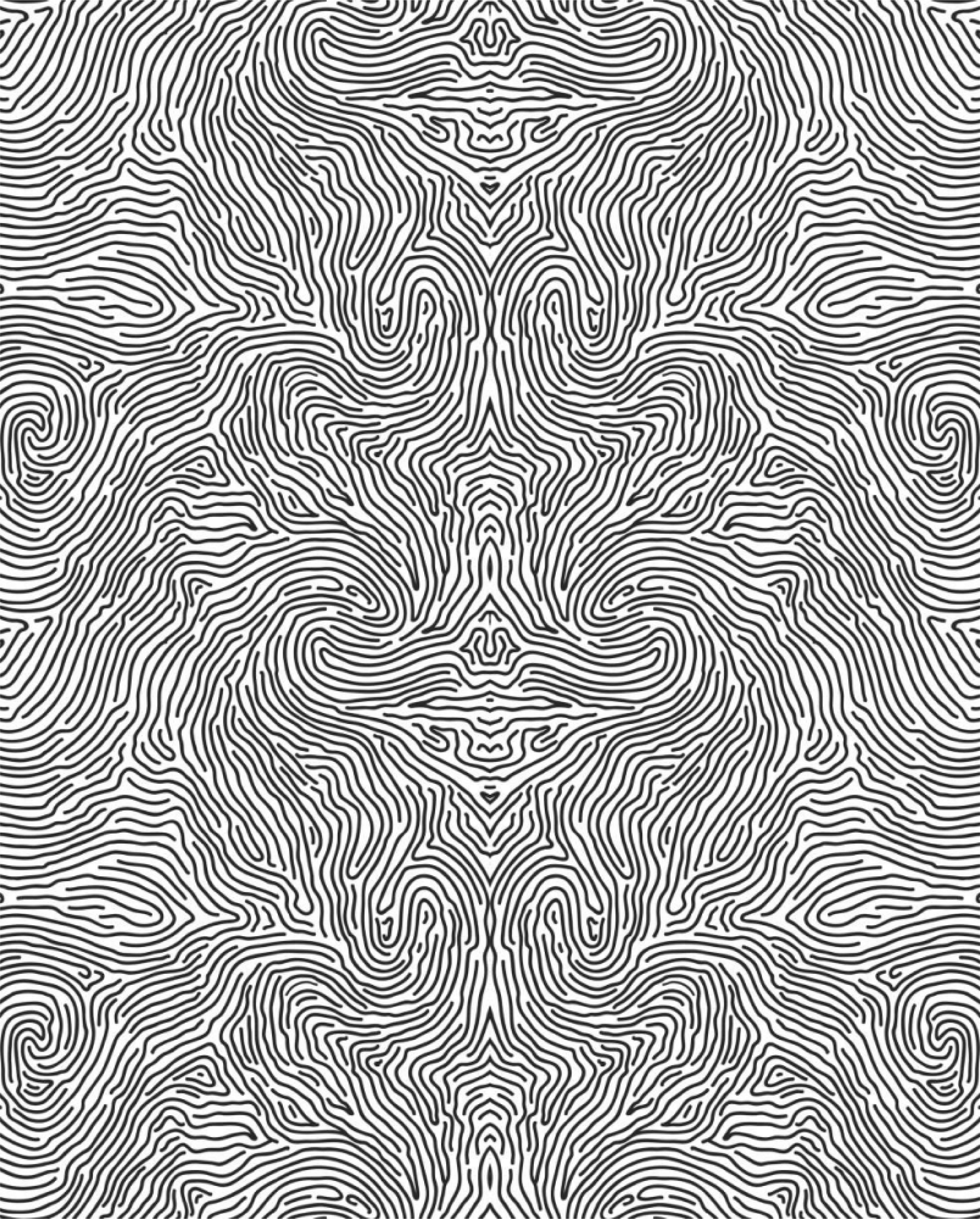
I saw an opportunity to extend the logo into the website by incorporating elements of it into the design itself. Using Illustrator, I created a seamless texture block for the background, incorporating the fingerprint lines from the logo.
This texture also resembled tree bark, symbolizing growth and new beginnings.
The subtle background texture adds personality and cohesion to the page, ensuring that each section feels like part of a single, unified design style while maintaining a minimal and futuristic aesthetic.
Making it responsive
Making the website responsive was one of the key challenges, as motion-heavy designs often break structurally on different screen sizes.
To address this, I carefully calculated pixel dimensions and experimented with layout adjustments to maintain visual balance and flow across devices.
I also redesigned sections that didn’t fit seamlessly in the responsive view. Once the design was fully optimized, I prepared the files for the developer, ensuring everything was ready for smooth implementation.
Final Thoughts
Finally, I delivered a cohesive design experience that seamlessly integrated motion, imagery, UI, and branding.
Every element, from the logo animation to the interactive slides and background textures, worked together to create a unified, immersive, and visually engaging website.
The client was highly satisfied with the execution, noting how the design brought the festival to life online while maintaining a minimal, futuristic, and approachable aesthetic.
This project reinforced the importance of harmonizing motion, visuals, and UI, and demonstrated how thoughtful design can elevate a static concept into an interactive and memorable digital experience.
The UI interactions
Next, I began designing the UI and interactions, drawing inspiration from benchmarking references in my personal library of UI patterns.
I focused on adding structure and emphasis to the slides, experimenting with motion to enhance the style while maintaining cohesion with the overall visual language.
For instance, I implemented a window-opening animation to symbolize new beginnings, while the hovering “I” in each section acted as an anchor point, guiding the viewer’s eye and giving structure to sections that otherwise felt visually suspended.
All subtle UI animations were tailored to the client’s request, ensuring the experience was engaging without being overwhelming.
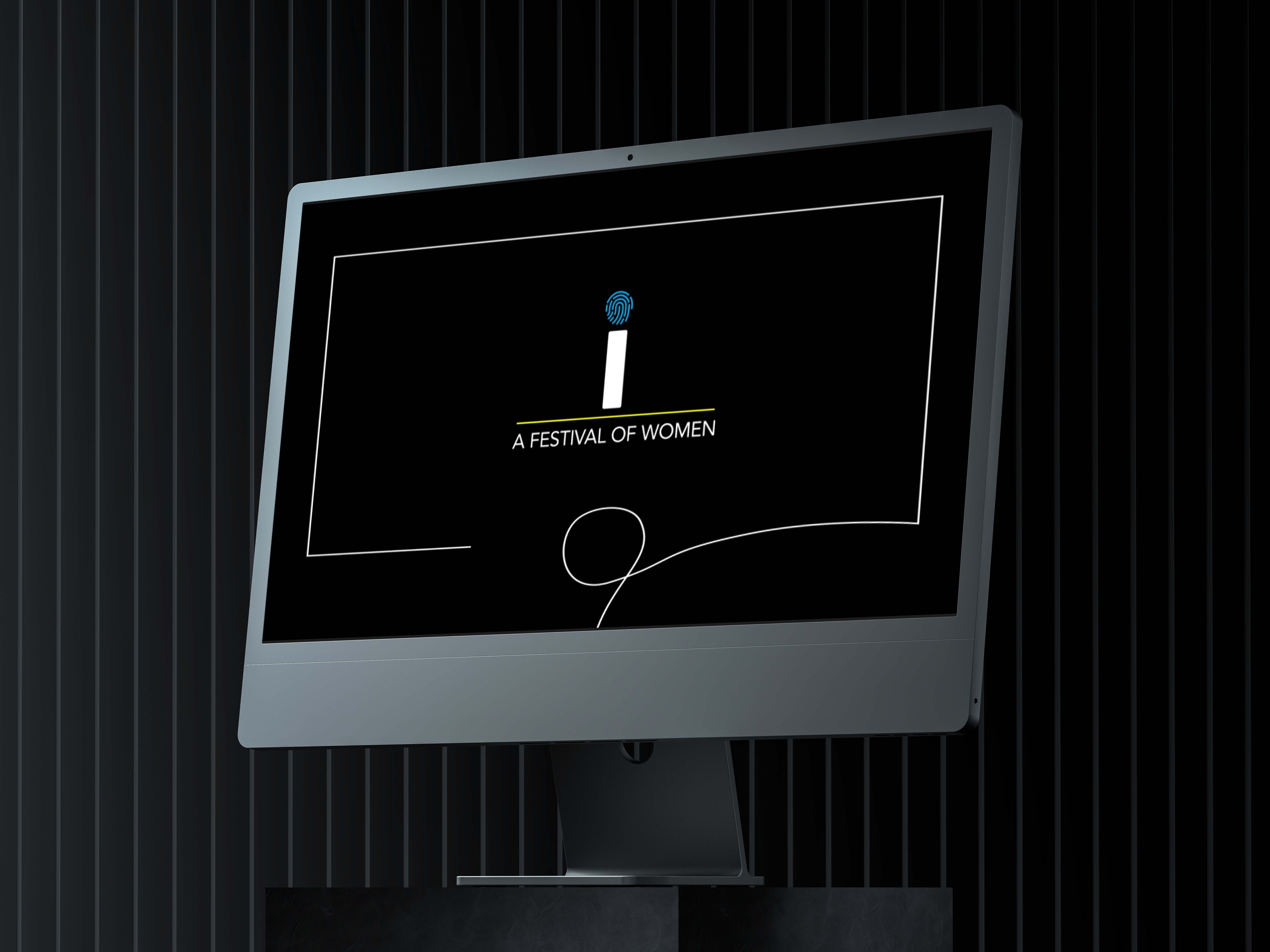
The Logo Animation
Next, I focused on the headline animation, starting with the motion design for the logo. I created three animation options for the client to choose from: the first emphasized growth, while the second highlighted unity.
The client preferred a more subtle approach, so we went with the second option, which offered clarity, fluidity, and a natural flow toward the lower part of the frame.
This selected animation then became the first frame, serving as a visual cue and reference for the style and motion language of the rest of the project’s animations.
OPTION 1
OPTION 2

I-FEST
i-Fest is a celebration of women’s creativity, energy, and influence across fields. The client approached me with a static PDF containing the event’s copy, logo, and imagery, and asked me to transform it into a vibrant, motion-driven experience that would bring the festival to life online.
A FESTIVAL FOR WOMEN
Static PDF: Containing the event’s copy, schedule, and overall layout.
Logo: The official i-Fest logo, which needed to be incorporated creatively.
Images/Photography: High-resolution images representing the festival, speakers, and attendees.
Brand Guidelines : Colors and Fonts
I began the project by carefully analyzing the materials provided by the client to determine how best to adapt them.
The first step was to recreate the PDF in Figma as an editable document, which allowed me to experiment with spacing, layout, and hierarchy.
With this editable version in place, I could plan the first draft, exploring how to structure the content and begin mapping out motion and visual elements.
The Logo Animation
Next, I focused on the headline animation, starting with the motion design for the logo. I created three animation options for the client to choose from: the first emphasized growth, while the second highlighted unity.
OPTION 1
OPTION 2
The client preferred a more subtle approach, so we went with the second option, which offered clarity, fluidity, and a natural flow toward the lower part of the frame.
Adding Motion to images
Through this process, I was able to create a cohesive visual harmony in motion, ensuring every image contributed to the overall dynamic and immersive feel of the project.
Depending on the image, I used a combination of tools and techniques:
Photoshop: To separate high-resolution images into layers for animation in After Effects.
After Effects: To create fluid motion and bring the layered images to life.
AI Tools: For animating images that suited a more complex or stylized motion approach.
Illustrator: To redraw vector-based images and maintain visual consistency.
The client provided a set of images that needed subtle motion to bring them to life. During our calls, I mapped out the animation plan, explaining how each element would move and interact.
The UI interactions
Next, I began designing the UI and interactions, drawing inspiration from benchmarking references in my personal library of UI patterns.
I focused on adding structure and emphasis to the slides, experimenting with motion to enhance the style while maintaining cohesion with the overall visual language.
For instance, I implemented a window-opening animation to symbolize new beginnings, while the hovering “I” in each section acted as an anchor point, guiding the viewer’s eye and giving structure to sections that otherwise felt visually suspended.
All subtle UI animations were tailored to the client’s request, ensuring the experience was engaging without being overwhelming.
Creating the background
I saw an opportunity to extend the logo into the website by incorporating elements of it into the design itself. Using Illustrator, I created a seamless texture block for the background, incorporating the fingerprint lines from the logo.
This texture also resembled tree bark, symbolizing growth and new beginnings.
The subtle background texture adds personality and cohesion to the page, ensuring that each section feels like part of a single, unified design style while maintaining a minimal and futuristic aesthetic.
Making it responsive
Making the website responsive was one of the key challenges, as motion-heavy designs often break structurally on different screen sizes.
To address this, I carefully calculated pixel dimensions and experimented with layout adjustments to maintain visual balance and flow across devices.
I also redesigned sections that didn’t fit seamlessly in the responsive view. Once the design was fully optimized, I prepared the files for the developer, ensuring everything was ready for smooth implementation.
Final Thoughts
Finally, I delivered a cohesive design experience that seamlessly integrated motion, imagery, UI, and branding.
Every element, from the logo animation to the interactive slides and background textures, worked together to create a unified, immersive, and visually engaging website.
Brief details
Project name
I-fest website design
Client
Lucid Lines
Industry
Festival, Women Empowerment, Cultural event
Duration
3 MONTHS
Deliverable
Responsive web design
Role
UI Design, Motion Design, Animations, Visual Design
TOOLS
Figma, Photoshop, After effects, Illustrator,
Runway ML, Midjourney
Client Provided Materials
Back
Back