Brief details
Duration
3 WEEKS
Deliverable
APP redesign
Role
UI Design, UX Design, Information Architecture
TOOLS
Figma, FIGJAM
Project name
CUSP - EYE CONTACT DATING
Client
CUSP
Industry
DATING, NETWORKING
An Overview
Cusp is a dating app that we redesigned as part of a university project. The goal was to make the app more usable and user-centered by addressing pain points in navigation, onboarding, and interactions.
Through research, audits, and iterative design, we created a streamlined experience that feels modern, intuitive, and better aligned with how users build connections today.

THE BREIF
The objective of this university project was to redesign the dating app "Cusp" to enhance its user interface and user experience. The app's mission is to match people who make eye contact in the real world.
The redesign focused on improving usability, strengthening safety features, and aligning the platform with user expectations. The brief outlined key areas of focus, including user research and a feature assessment. The final deliverables were to include user personas, wireframes, prototypes, and a presentation.

Research and findings
Our research and benchmarking provided crucial data to inform the Cusp app redesign. Key statistics revealed that dating app users face significant issues with messaging dynamics, safety, and a desire for meaningful connections.
Specifically, we found a stark contrast in messaging experiences between men and women, with 54% of women feeling overwhelmed and 54% of men feeling insecure. Additionally, user safety is a major concern, as 31% of women have experienced assault from someone they met on a dating app.
These findings underscore the importance of our redesign efforts to create a safer, more balanced, and more user-centric platform.


Competitive Analysis & Benchmarking
We conducted a competitive analysis to understand where Cusp stood in the crowded dating app market. By benchmarking against top competitors like Tinder, Bumble, and Hinge, we were able to visualize Cusp's position and identify clear areas for improvement.
The analysis revealed that the original Cusp app fell short in nearly every key area of modern dating apps, including onboarding, safety measures, and engaging profile prompts. The lack of these features made it difficult for Cusp to compete with more established platforms.
However, the analysis also confirmed that Cusp's unique "Eye Contact" feature was its core differentiator, providing a valuable foundation to build upon. This process allowed us to prioritize our redesign efforts and create a strategic roadmap to align the app with user expectations. .

USABILITY TEST AND USER INTERVIWES
Following our competitive analysis, we conducted unaided usability tests and user interviews to gain a deeper understanding of real-world user behaviors and pain points within the existing Cusp app. The primary goal of the usability tests was to observe users successfully signing up and creating a profile, while also noting points of friction where users sought help or expressed confusion. These insights directly complemented our heuristic audit findings and provided a robust foundation for the redesign.
These direct user insights provided invaluable qualitative data, confirming the heuristic violations and pinpointing critical areas for improvement to enhance usability, trust, and feature discoverability.
Trust and Safety: Users expressed a clear lack of trust, stemming from confusing navigation and unsubstantiated safety claims within the app.
Onboarding Friction: The signup process was identified as lengthy and unclear, exacerbated by poorly placed buttons, leading to user frustration.
Feature Overload/Misplacement: There was an overemphasis on the map feature, which detracted from the core dating functionalities.
Core Feature Obscurity: Users consistently failed to understand or even notice the primary "eye contact" feature, indicating a significant discoverability issue.
Profile Setup Issues: Irrelevant and confusing profile questions reduced user engagement, while mandatory profile pictures were found to be frustrating and confusing.
CUSP
DATING APP REDESIGN
As part of a university project, I redesigned Cusp, a dating app, by auditing its usability gaps and improving onboarding, navigation, and interactions. The result was a cleaner, more intuitive experience that better supported meaningful connections.
Usability Audit: Heuristic Violations
Our usability audit of the existing Cusp app identified several critical issues by applying Jakob Nielsen's usability heuristics. The findings highlight significant gaps in the user experience:
Aesthetic and Minimalist Design: The app's visual design is a major concern. The startup page is visually bland and the map is unnecessarily large, creating clutter and a lack of visual hierarchy. These issues detract from the overall user experience and fail to present a professional, engaging interface.
Match Between System and the Real World: The app's language and functionality do not align with user expectations. The prompts are overly suggestive and profile questions are generic and sometimes insensitive, such as the option "Over a few pounds," which violates social norms and degrades user self-esteem.
Additionally, the ability for users to receive messages without a mutual match is a severe violation of real-world safety expectations for a dating app.
Consistency and Standards: The app suffers from a lack of consistency. For instance, the presence of two separate pages that serve the same function confuses users and forces them to learn multiple ways to accomplish a single task.
User Control and Freedom: A core feature, the "Eye Contact" map, infringes upon user control. The fear of being identified by others can discourage users from freely browsing the app, effectively limiting their freedom of exploration and reducing overall engagement.
Visibility of System Status: The app lacks clear signifiers to guide users. The main CTA does not stand out, failing to inform the user of what action they should take, leading to reduced engagement.


LOW FIDELITY WIREFRAMES
Based on our user research, the original onboarding process was a significant point of friction. Users found it lengthy and unclear, with poorly placed buttons that led to frustration. To address this, we redesigned the flow to be more efficient and intuitive.
Our new design applies key UX principles:
Progressive Disclosure: By breaking the process into clear, manageable steps, we avoid overwhelming the user and make the journey feel less daunting.
Fitts's Law: We placed critical calls-to-action (CTAs) in easily accessible locations, reducing the time and effort needed for users to complete a task.
Streamlined Experience: The new flow guides users with clear, sequential steps, incorporating interactive tutorials to familiarize them with key app features from the very beginning.
These changes directly address the usability issues identified in our research, leading to a more seamless and user-friendly experience from the very first interaction.


THE REDESIGN


the ui kit
COLOUR PALLETTE
F21B3F
0D0630
31256D
7886E0
E0DAFF
BUTTONS
BUTTON
BUTTON
BUTTON
TYPOGRAPHY
Headline Font - Canela Text
A B C D E F G H I J K L M N O P Q R S T U V W X Y Z
Body Copy - Urabnist
A B C D E F G H I J K L M N O P Q R S T U V W X Y Z
A B C D E F G H I J K L M N O P Q R S T U V W X Y Z
A B C D E F G H I J K L M N O P Q R S T U V W X Y Z
TEXT STYLES

Back
CUSP
DATING APP REDESIGN
As part of a university project, I redesigned Cusp, a dating app, by auditing its usability gaps and improving onboarding, navigation, and interactions. The result was a cleaner, more intuitive experience that better supported meaningful connections.
Brief details
Project name
CUSP - EYE CONTACT DATING
Client
CUSP
Industry
DATING, NETWORKING
Duration
3 WEEKS
Deliverable
APP redesign
Role
UI Design, UX Design, Information Architecture
TOOLS
Figma, FIGJAM
An Overview
Cusp is a dating app that we redesigned as part of a university project. The goal was to make the app more usable and user-centered by addressing pain points in navigation, onboarding, and interactions.
Through research, audits, and iterative design, we created a streamlined experience that feels modern, intuitive, and better aligned with how users build connections today.
THE BREIF
The objective of this university project was to redesign the dating app "Cusp" to enhance its user interface and user experience. The app's mission is to match people who make eye contact in the real world.
The redesign focused on improving usability, strengthening safety features, and aligning the platform with user expectations. The brief outlined key areas of focus, including user research and a feature assessment. The final deliverables were to include user personas, wireframes, prototypes, and a presentation.
Research and findings
Our research and benchmarking provided crucial data to inform the Cusp app redesign. Key statistics revealed that dating app users face significant issues with messaging dynamics, safety, and a desire for meaningful connections.
Specifically, we found a stark contrast in messaging experiences between men and women, with 54% of women feeling overwhelmed and 54% of men feeling insecure. Additionally, user safety is a major concern, as 31% of women have experienced assault from someone they met on a dating app.
These findings underscore the importance of our redesign efforts to create a safer, more balanced, and more user-centric platform.
Competitive Analysis & Benchmarking
We conducted a competitive analysis to understand where Cusp stood in the crowded dating app market. By benchmarking against top competitors like Tinder, Bumble, and Hinge, we were able to visualize Cusp's position and identify clear areas for improvement.
The analysis revealed that the original Cusp app fell short in nearly every key area of modern dating apps, including onboarding, safety measures, and engaging profile prompts. The lack of these features made it difficult for Cusp to compete with more established platforms.
However, the analysis also confirmed that Cusp's unique "Eye Contact" feature was its core differentiator, providing a valuable foundation to build upon. This process allowed us to prioritize our redesign efforts and create a strategic roadmap to align the app with user expectations. .
Usability Audit: Heuristic Violations
Our usability audit of the existing Cusp app identified several critical issues by applying Jakob Nielsen's usability heuristics. The findings highlight significant gaps in the user experience:
Aesthetic and Minimalist Design: The app's visual design is a major concern. The startup page is visually bland and the map is unnecessarily large, creating clutter and a lack of visual hierarchy. These issues detract from the overall user experience and fail to present a professional, engaging interface.
Match Between System and the Real World: The app's language and functionality do not align with user expectations. The prompts are overly suggestive and profile questions are generic and sometimes insensitive, such as the option "Over a few pounds," which violates social norms and degrades user self-esteem.
Additionally, the ability for users to receive messages without a mutual match is a severe violation of real-world safety expectations for a dating app.
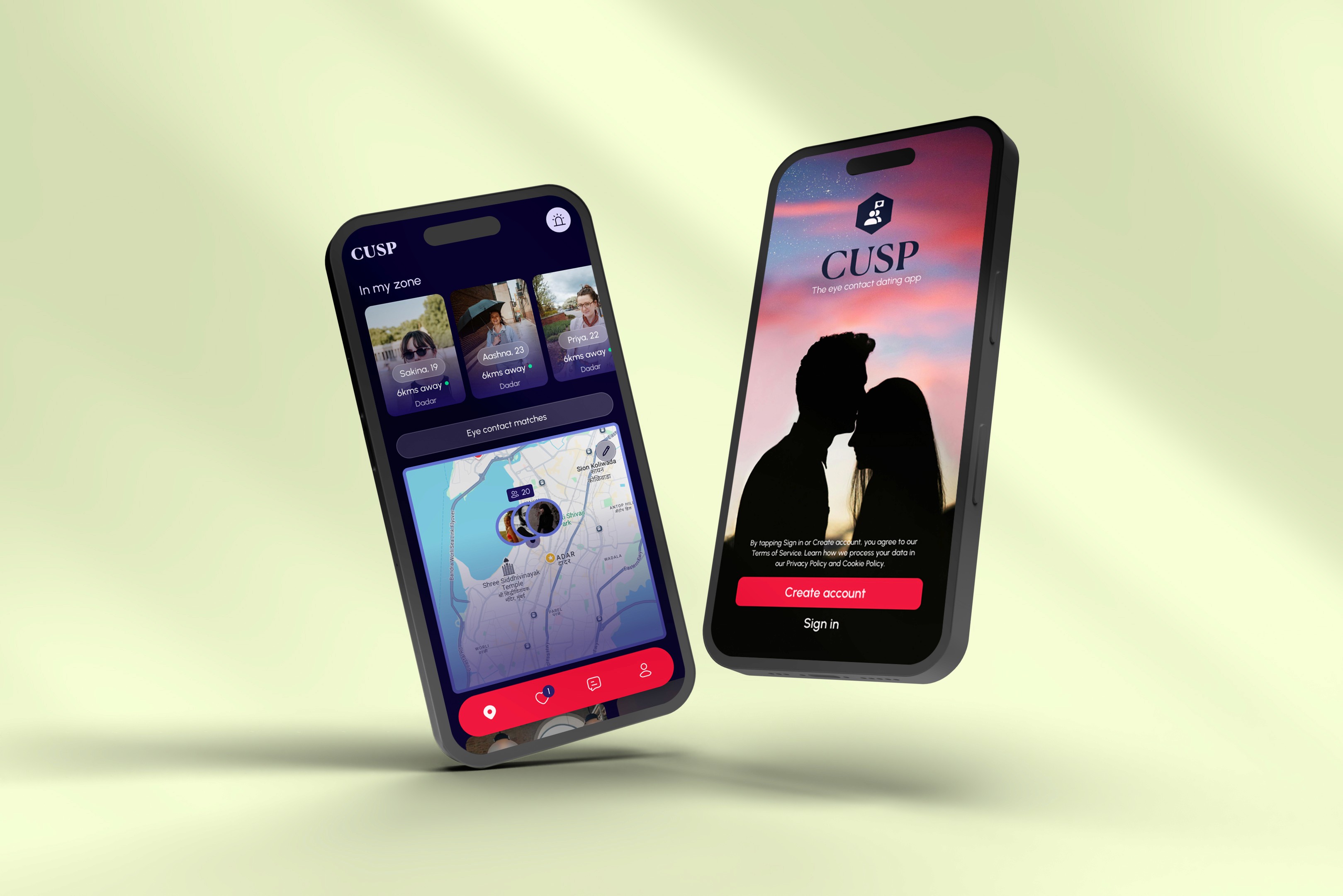
The old version
Consistency and Standards: The app suffers from a lack of consistency. For instance, the presence of two separate pages that serve the same function confuses users and forces them to learn multiple ways to accomplish a single task.
User Control and Freedom: A core feature, the "Eye Contact" map, infringes upon user control. The fear of being identified by others can discourage users from freely browsing the app, effectively limiting their freedom of exploration and reducing overall engagement.
Visibility of System Status: The app lacks clear signifiers to guide users. The main CTA does not stand out, failing to inform the user of what action they should take, leading to reduced engagement.
LOW FIDELITY WIREFRAMES
Based on our user research, the original onboarding process was a significant point of friction. Users found it lengthy and unclear, with poorly placed buttons that led to frustration. To address this, we redesigned the flow to be more efficient and intuitive.
Our new design applies key UX principles:
Progressive Disclosure: By breaking the process into clear, manageable steps, we avoid overwhelming the user and make the journey feel less daunting.
Fitts's Law: We placed critical calls-to-action (CTAs) in easily accessible locations, reducing the time and effort needed for users to complete a task.
Streamlined Experience: The new flow guides users with clear, sequential steps, incorporating interactive tutorials to familiarize them with key app features from the very beginning.
These changes directly address the usability issues identified in our research, leading to a more seamless and user-friendly experience from the very first interaction.
the ui kit
F21B3F
31256D
E0DAFF
0D0630
7886E0
COLOUR PALLETTE
TYPOGRAPHY
Headline Font - Canela Text
A B C D E F G H I J K L M N O P Q R S T U V W X Y Z
Body Copy - Urabnist
A B C D E F G H I J K L M N O P Q R S T U V W X Y Z
A B C D E F G H I J K L M N O P Q R S T U V W X Y Z
A B C D E F G H I J K L M N O P Q R S T U V W X Y Z
TEXT STYLES
BUTTONS
BUTTON
BUTTON
BUTTON
THE REDESIGN screens
Back