CHRONOVORE
CAFE
THE FUTURE OF FOOD
Chronovore Cafe is a self-initiated design concept that explores the future of the food industry in the year 2049. This project was a creative exercise to push the boundaries of traditional UI/UX design by reimagining the entire dining experience—from branding and motion to a fully-realized user interface. The goal was to build a visionary digital solution that not only meets the needs of a futuristic consumer but also challenges their perception of time and space.
Brief details
Duration
2 weeks
Deliverable
App design, Brand identity,
Design solution
Role
UI Design, Brand Identity Design, Motion Design, Animation
TOOLS
Figma, Photoshop, After effects, Illustrator, Runway ML,
Project name
cHRONOVORE CAFE
Client
University Submission
Industry
Future of Food, Ordering, Food and Beverages
The Challenge
The project began with a single design prompt: "To create a revolutionary restaurant concept for the year 2049."
My task was to reimagine the entire eating experience within a precise futuristic scenario.
The goal was to build a brand and a digital product that was not only memorable and engaging but also delivered a distinctly "disorienting" experience. This was an opportunity to push beyond traditional food-ordering apps and design a solution that challenged our perception of time and space in a dining environment.
The Scenario & Concept
The project began by establishing a futuristic scenario: a world in 2049 grappling with the lingering consequences of a five-year pandemic and global food shortages. In this world of despair, a visionary scientist, Dr. Yann, returns from a long-term mission with a solution.
He unveils Chronovore Cafe, a revolutionary restaurant concept powered by his time-travel invention, the Chronovore Nexus. The cafe's unique value proposition is its ability to source food from different historical eras.
This concept was designed to do more than just solve a problem, it was about providing a hopeful, symbolic experience. Patrons could savor flavors from the past, embracing a future free from hunger and embodying the very resilience of humanity.


Concept Note
Harnessing the power of time travel, Chronovore Cafe embarks on a mission to combat global hunger. By forging a link between past epochs and the present, we transcend the boundaries of time, retrieving bountiful resources from bygone eras to nourish a starving world.
Creative Direction: A Retro-Futuristic Vision
Before designing a single screen, I developed this mood board to serve as our visual foundation. The goal was to build a brand identity that felt both timeless and futuristic, perfectly capturing the project's unique tone.
Retro-Futuristic Aesthetics: We merged the bold, graphic patterns of mid-century modern design with abstract, futuristic elements. This created an aesthetic that felt both nostalgic and forward-thinking.
The Concept of Time: The mood board directly references time travel through elements like the "Press to Time Travel" button and a DeLorean sign. The use of dynamic grids and abstract shapes represents the "disorienting" and temporal nature of the experience.
Vibrant Palette: The chosen color palette of vibrant yellows, oranges, and blues, anchored by black and white, was selected to evoke a sense of energy, innovation, and bold creativity.

The Logo & Tagline
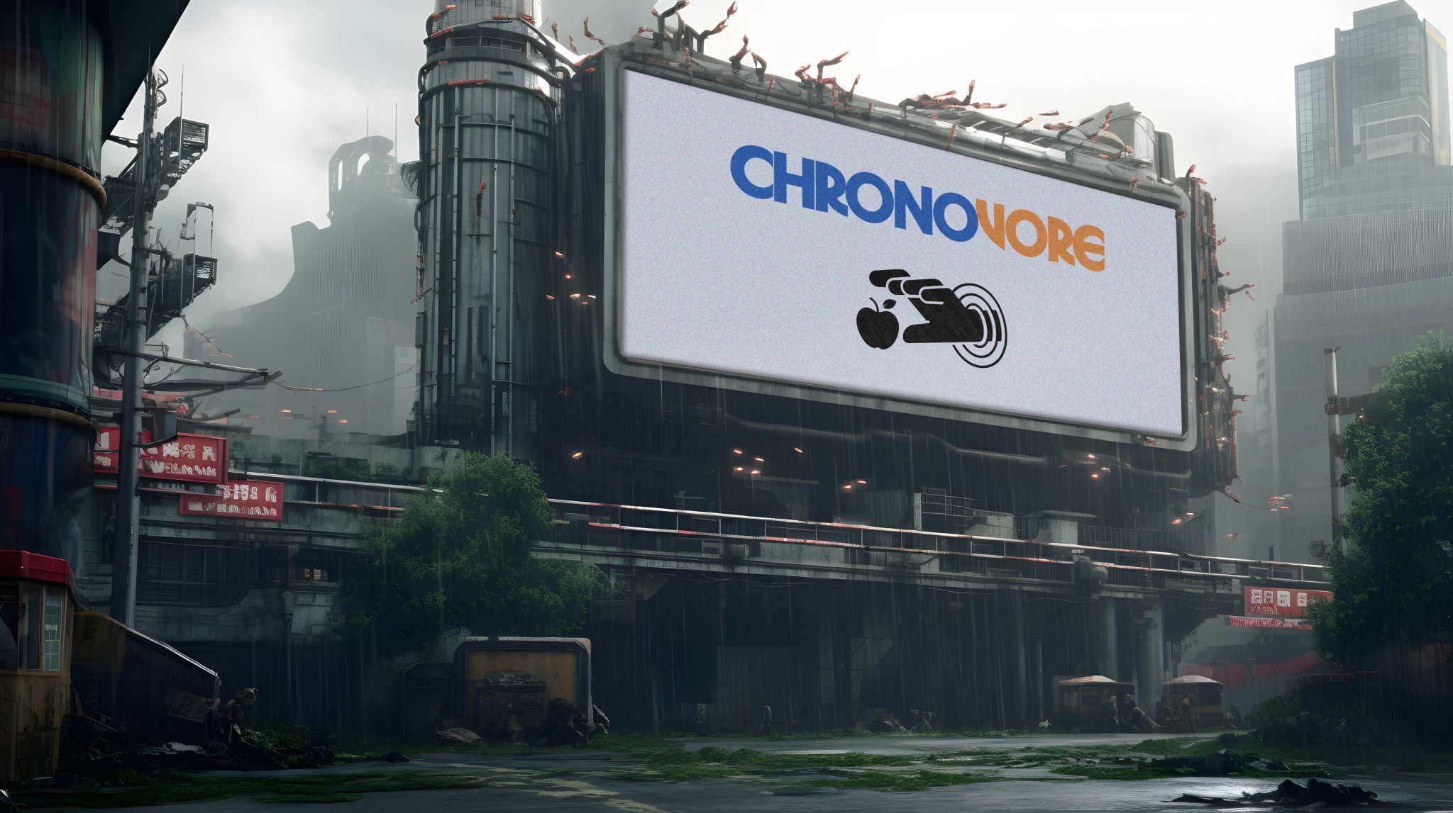
The brand's identity was designed to capture the project's retro-futuristic vision. I created a logo, tagline, and brand icon that communicate the core concept in a bold and memorable way.
The Logotype: The custom logotype uses Herbus, a modified version of the timeless typeface Avant Garde. The deliberate choice of a font known for its longevity and classic appeal reinforces the project's central theme of time, while the fragmented cut-outs in the letters visually hint at the disruption and manipulation of temporal flow.
The Tagline: The tagline "Past Meets Palate" is a concise and clever summary of the entire concept. It instantly communicates the cafe's unique value proposition: bringing the flavors of history to the modern diner.
The Brand Icon: This icon serves as a visual shorthand for the brand. It features a robotic hand emerging from a portal to retrieve a single apple, perfectly symbolizing the core mission of using technology and time travel to source food.

The Chronopod V7
In the world of 2049, where a global conflict has destroyed conventional signals, the Chronopod V7 serves as a new method of communication.
This speculative device allows people to connect using temporal frequencies, making it both a lifeline for communication and a key piece of the Chronovore Cafe experience.
Its role in the story demonstrates how every aspect of this concept is rooted in the narrative, blending a fictional world with a functional design solution.
The NEXUS
The NEXUS is the core technology that makes the Chronovore experience possible.
This device, invented in space, harnesses the energy to create a portal, allowing access to the Menu of Time.
As a key strategic decision, NEXUS devices are available exclusively at Chronovore Cafes. This not only drives foot traffic but also positions the cafe as an exclusive destination where the physical and digital experiences are inseparably linked.
The Physical Space: A Sketch of the Cafe
To complete the vision, I created this sketch of the Chronovore Cafe’s physical space.
The design reflects the brand’s core principles, merging the retro-futuristic aesthetic of the mood board with a bold, modern architectural style.
The building itself becomes a part of the brand. It incorporates the same geometric shapes, vibrant colors, and iconic branding elements, including the custom logotype and brand icon.
This ensures a cohesive experience where the physical location and the digital product feel like a single, unified concept.
The User Experience: Navigating the Timeline
The user interface was designed to guide users through a complex, "disorienting" journey with clarity and purpose. The experience begins by bridging the physical and digital worlds to access the Menu of Time.
Pairing the Devices: The user's journey begins with a clear prompt to physically pair their Chronopod V7 with the NEXUS portal. This simple, on-screen instruction acts as the first step in the time-travel process, seamlessly connecting the digital UI to the physical hardware.
Exploring the Timeline: After pairing, the user is presented with the "Timeline," where they can browse by different eras and specific time periods. This organized approach to time travel transforms an abstract concept into a simple, browsable menu.
A Taste of the Past: The menu screens display historical dishes with rich descriptions, bringing the flavors of bygone eras to life. Each dish is a direct result of the time-travel technology, reinforcing the core brand narrative.
The Final Transaction: The cart and checkout process includes unique, on-brand details like the "Bridge Tax" and "R&D Overhead." This creative touch adds a final layer of storytelling to the transaction, reminding the user that they are part of a revolutionary, futuristic experience.
This UI successfully turns a complex, narrative-driven concept into a functional and engaging user experience that is both intuitive and deeply immersive.


Get in touch
CHRONOVORE
CAFE
THE FUTURE OF FOOD
Chronovore Cafe is a self-initiated design concept that explores the future of the food industry in the year 2049. This project was a creative exercise to push the boundaries of traditional UI/UX design by reimagining the entire dining experience—from branding and motion to a fully-realized user interface. The goal was to build a visionary digital solution that not only meets the needs of a futuristic consumer but also challenges their perception of time and space.
Brief details
Project name
Client
University Submission
Industry
Future of Food, Ordering, Food and Beverages
Duration
2 weeks
Deliverable
App design, Brand identity,
Design solution
Role
UI Design, Brand Identity Design, Motion Design, Animation
TOOLS
Figma, Photoshop, After effects, Illustrator, Runway ML,
The Challenge
The project began with a single design prompt: "To create a revolutionary restaurant concept for the year 2049."
My task was to reimagine the entire eating experience within a precise futuristic scenario.
The goal was to build a brand and a digital product that was not only memorable and engaging but also delivered a distinctly "disorienting" experience. This was an opportunity to push beyond traditional food-ordering apps and design a solution that challenged our perception of time and space in a dining environment.
The Scenario & Concept
The project began by establishing a futuristic scenario: a world in 2049 grappling with the lingering consequences of a five-year pandemic and global food shortages. In this world of despair, a visionary scientist, Dr. Yann, returns from a long-term mission with a solution.
He unveils Chronovore Cafe, a revolutionary restaurant concept powered by his time-travel invention, the Chronovore Nexus. The cafe's unique value proposition is its ability to source food from different historical eras.
This concept was designed to do more than just solve a problem, it was about providing a hopeful, symbolic experience. Patrons could savor flavors from the past, embracing a future free from hunger and embodying the very resilience of humanity.
Concept Note
Harnessing the power of time travel, Chronovore Cafe embarks on a mission to combat global hunger. By forging a link between past epochs and the present, we transcend the boundaries of time, retrieving bountiful resources from bygone eras to nourish a starving world.
Creative Direction:
A Retro-Futuristic Vision
Before designing a single screen, I developed this mood board to serve as our visual foundation. The goal was to build a brand identity that felt both timeless and futuristic, perfectly capturing the project's unique tone.
Retro-Futuristic Aesthetics: We merged the bold, graphic patterns of mid-century modern design with abstract, futuristic elements. This created an aesthetic that felt both nostalgic and forward-thinking.
The Concept of Time: The mood board directly references time travel through elements like the "Press to Time Travel" button and a DeLorean sign. The use of dynamic grids and abstract shapes represents the "disorienting" and temporal nature of the experience.
Vibrant Palette: The chosen color palette of vibrant yellows, oranges, and blues, anchored by black and white, was selected to evoke a sense of energy, innovation, and bold creativity.
The Logo & Tagline
The brand's identity was designed to capture the project's retro-futuristic vision. I created a logo, tagline, and brand icon that communicate the core concept in a bold and memorable way.
The Logotype: The custom logotype uses Herbus, a modified version of the timeless typeface Avant Garde. The deliberate choice of a font known for its longevity and classic appeal reinforces the project's central theme of time, while the fragmented cut-outs in the letters visually hint at the disruption and manipulation of temporal flow.
The Tagline: The tagline "Past Meets Palate" is a concise and clever summary of the entire concept. It instantly communicates the cafe's unique value proposition: bringing the flavors of history to the modern diner.
The Brand Icon: This icon serves as a visual shorthand for the brand. It features a robotic hand emerging from a portal to retrieve a single apple, perfectly symbolizing the core mission of using technology and time travel to source food.
The Chronopod V7
In the world of 2049, where a global conflict has destroyed conventional signals, the Chronopod V7 serves as a new method of communication.
This speculative device allows people to connect using temporal frequencies, making it both a lifeline for communication and a key piece of the Chronovore Cafe experience.
Its role in the story demonstrates how every aspect of this concept is rooted in the narrative, blending a fictional world with a functional design solution.
The NEXUS
The NEXUS is the core technology that makes the Chronovore experience possible.
This device, invented in space, harnesses the energy to create a portal, allowing access to the Menu of Time.
As a key strategic decision, NEXUS devices are available exclusively at Chronovore Cafes. This not only drives foot traffic but also positions the cafe as an exclusive destination where the physical and digital experiences are inseparably linked.
The Physical Space:
A Sketch of the Cafe
To complete the vision, I created this sketch of the Chronovore Cafe’s physical space.
The design reflects the brand’s core principles, merging the retro-futuristic aesthetic of the mood board with a bold, modern architectural style.
The building itself becomes a part of the brand. It incorporates the same geometric shapes, vibrant colors, and iconic branding elements, including the custom logotype and brand icon.
This ensures a cohesive experience where the physical location and the digital product feel like a single, unified concept.
The User Experience:
Navigating the Timeline
The user interface was designed to guide users through a complex, "disorienting" journey with clarity and purpose. The experience begins by bridging the physical and digital worlds to access the Menu of Time.
Pairing the Devices: The user's journey begins with a clear prompt to physically pair their Chronopod V7 with the NEXUS portal. This simple, on-screen instruction acts as the first step in the time-travel process, seamlessly connecting the digital UI to the physical hardware.
Exploring the Timeline: After pairing, the user is presented with the "Timeline," where they can browse by different eras and specific time periods. This organized approach to time travel transforms an abstract concept into a simple, browsable menu.
A Taste of the Past: The menu screens display historical dishes with rich descriptions, bringing the flavors of bygone eras to life. Each dish is a direct result of the time-travel technology, reinforcing the core brand narrative.
The Final Transaction: The cart and checkout process includes unique, on-brand details like the "Bridge Tax" and "R&D Overhead." This creative touch adds a final layer of storytelling to the transaction, reminding the user that they are part of a revolutionary, futuristic experience.
This UI successfully turns a complex, narrative-driven concept into a functional and engaging user experience that is both intuitive and deeply immersive.
cHRONOVORE CAFE
Back